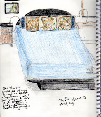
Okay, posting this picture is requiring a little bravery- I don't like it and it's not at all professional or drawn well, but.....as I keep yelling at my inner critic, the point is to keep moving forward and trying more and more difficult subjects. If it was easy, everyone would be doing it, right?!
Jim got me started on this Everyday Matters list and it's definitely been a challenge for me! The perspective is definitely off and it's a platform bed with the platform extended too far (you can see the line where I should have stopped). I would very much welcome any suggestions/comments/critiques about how to address my perspective issues.....
Think I'm going to try a different medium tomorrow :)


2 comments:
I'm toasting you, your bravery and your commitment to the process.
Lapoynte once said on this blog, "..the more exact, the less interesting." or similar. I find that true in sketches to which I am most drawn. In my own work, jewelry, sculpture, bookart, etc, the more I try the more literary, stilted and less interesting the work becomes. I "get" that, though still challenging to not "do" that.
Hi Terrie..! I think your perspective was actually pretty good - especially given how many different planes you were dealing with; the bed, the headboard and end section, the side tables. There are some great books on perspective but they get very detailed (and pretty expensive sometimes!). But if you type 'drawing perspective' into YouTube there are some terrific tutorials on it that are great starting points...
Post a Comment